HIGH SCHOOL ENTRY LOBBY RENOVATION.
BINGHAMTON CITY SCHOOL DISTRICT
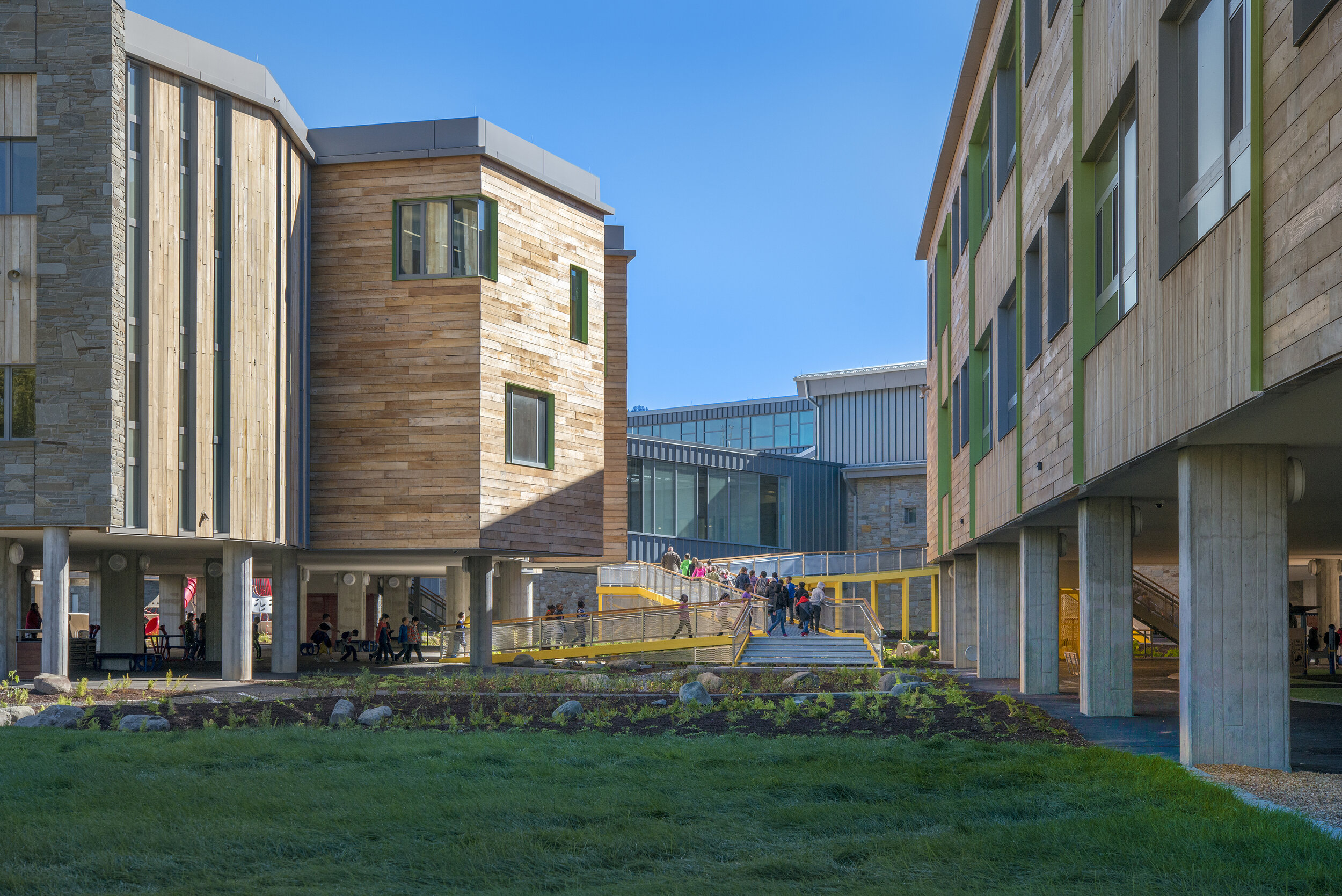
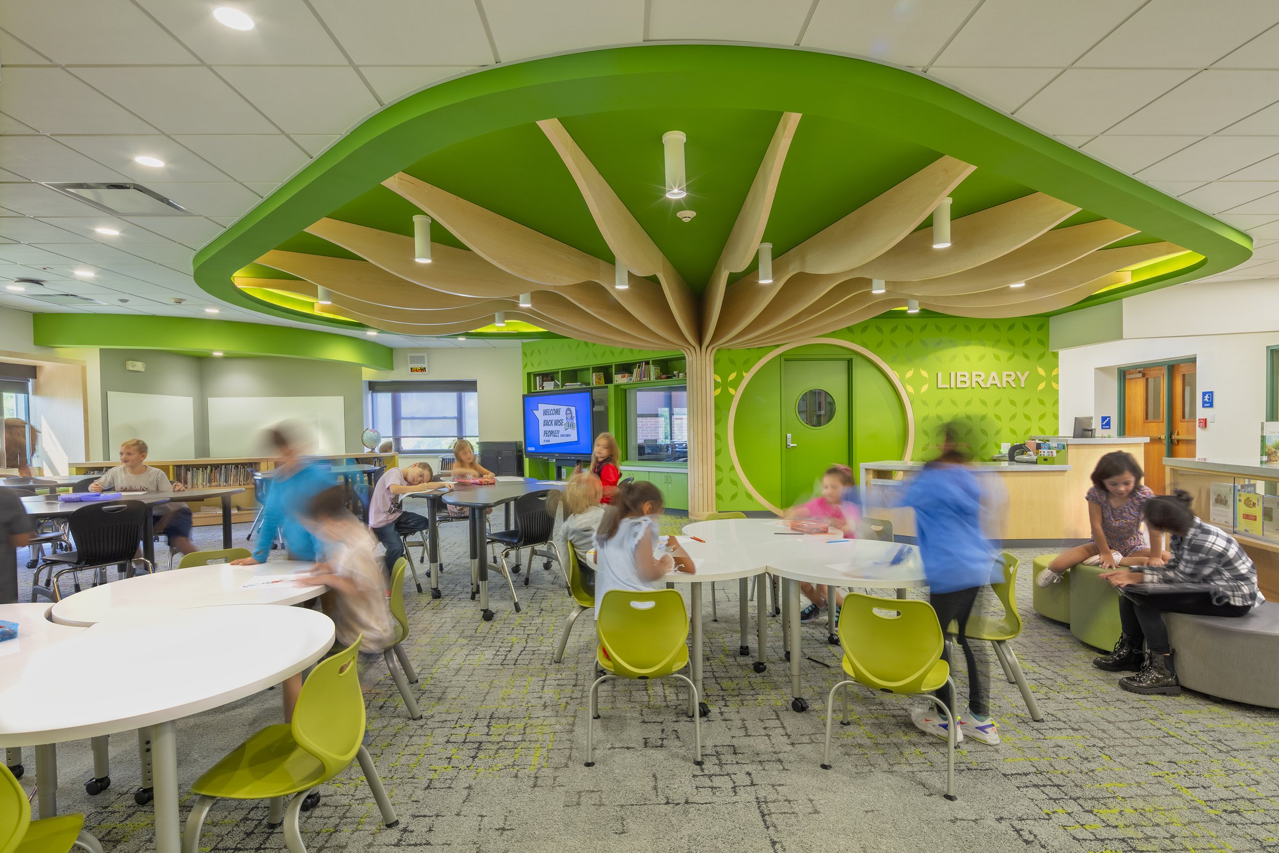
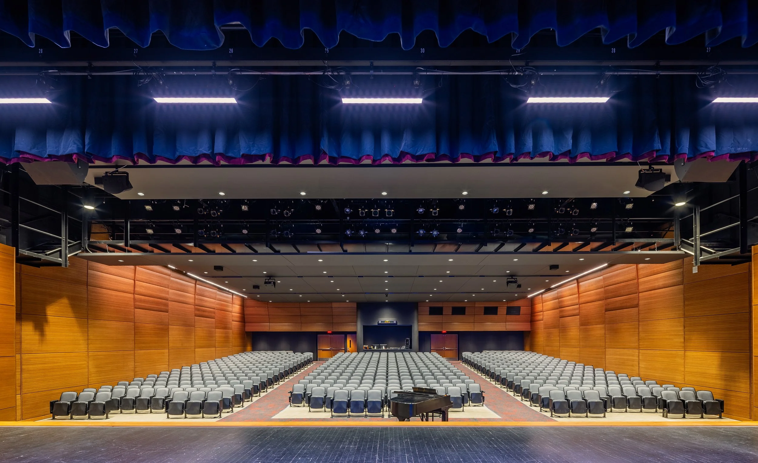
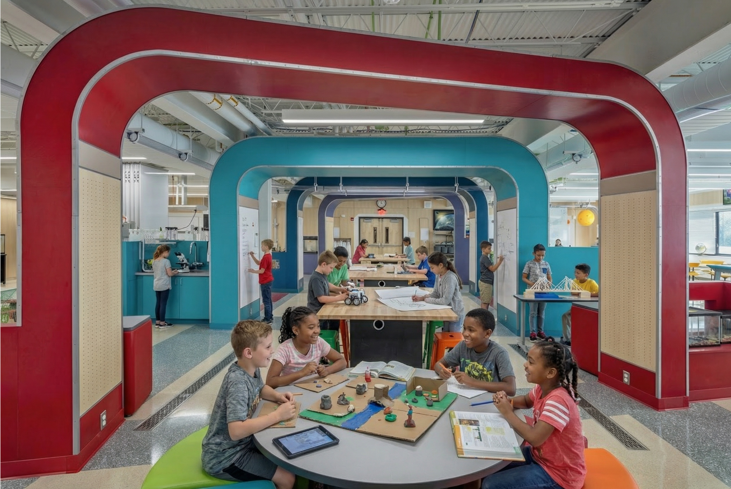
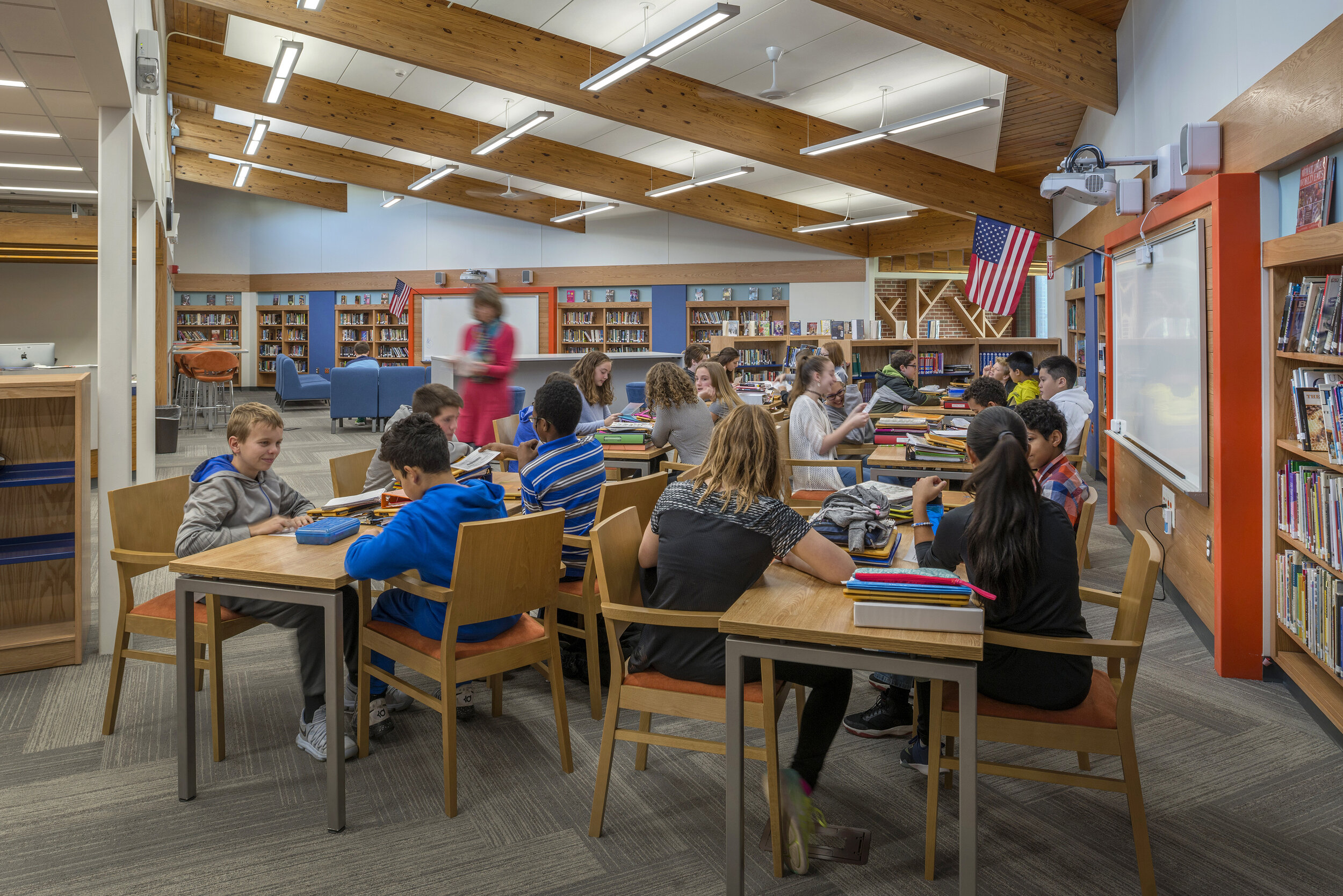
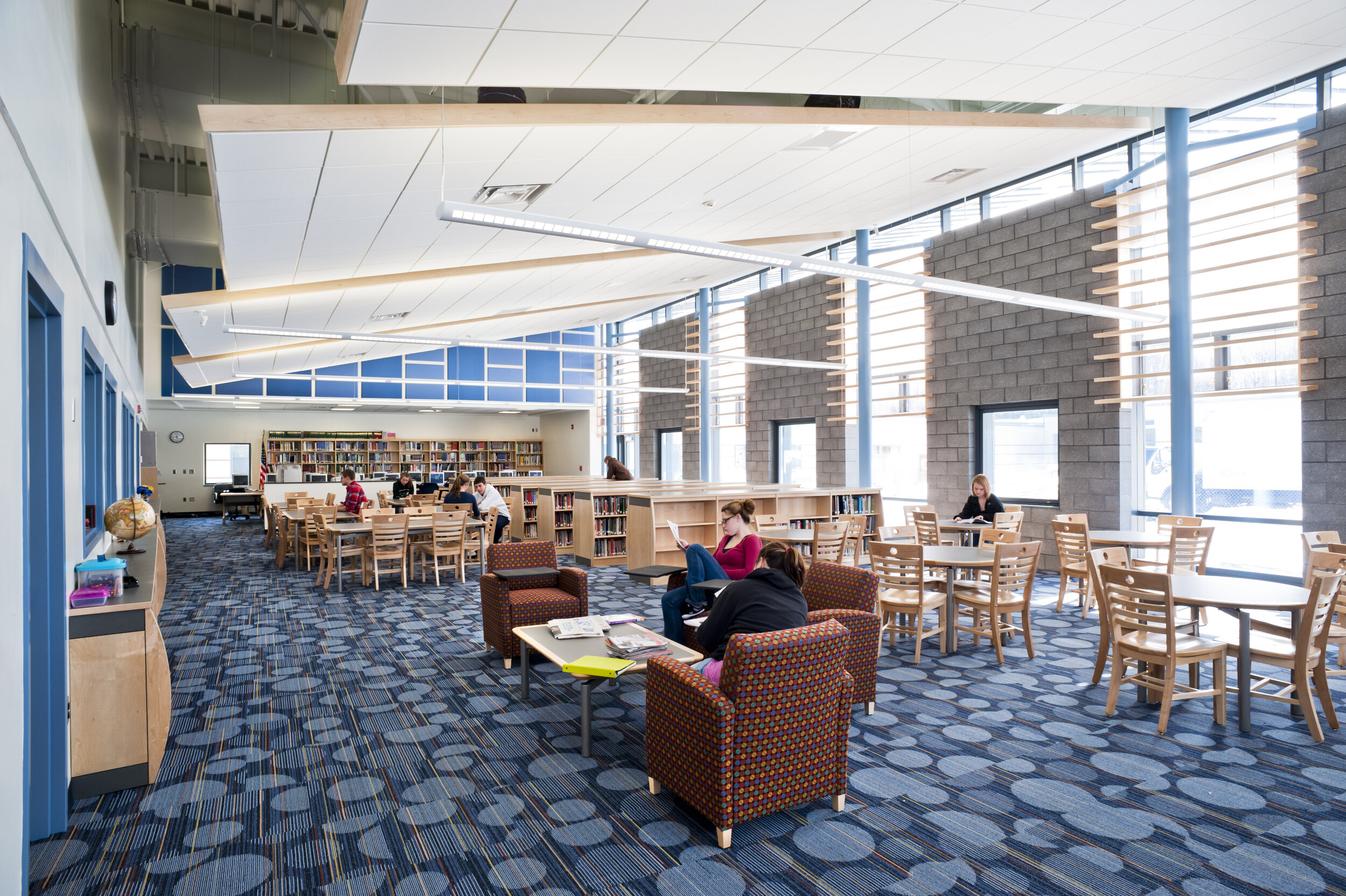
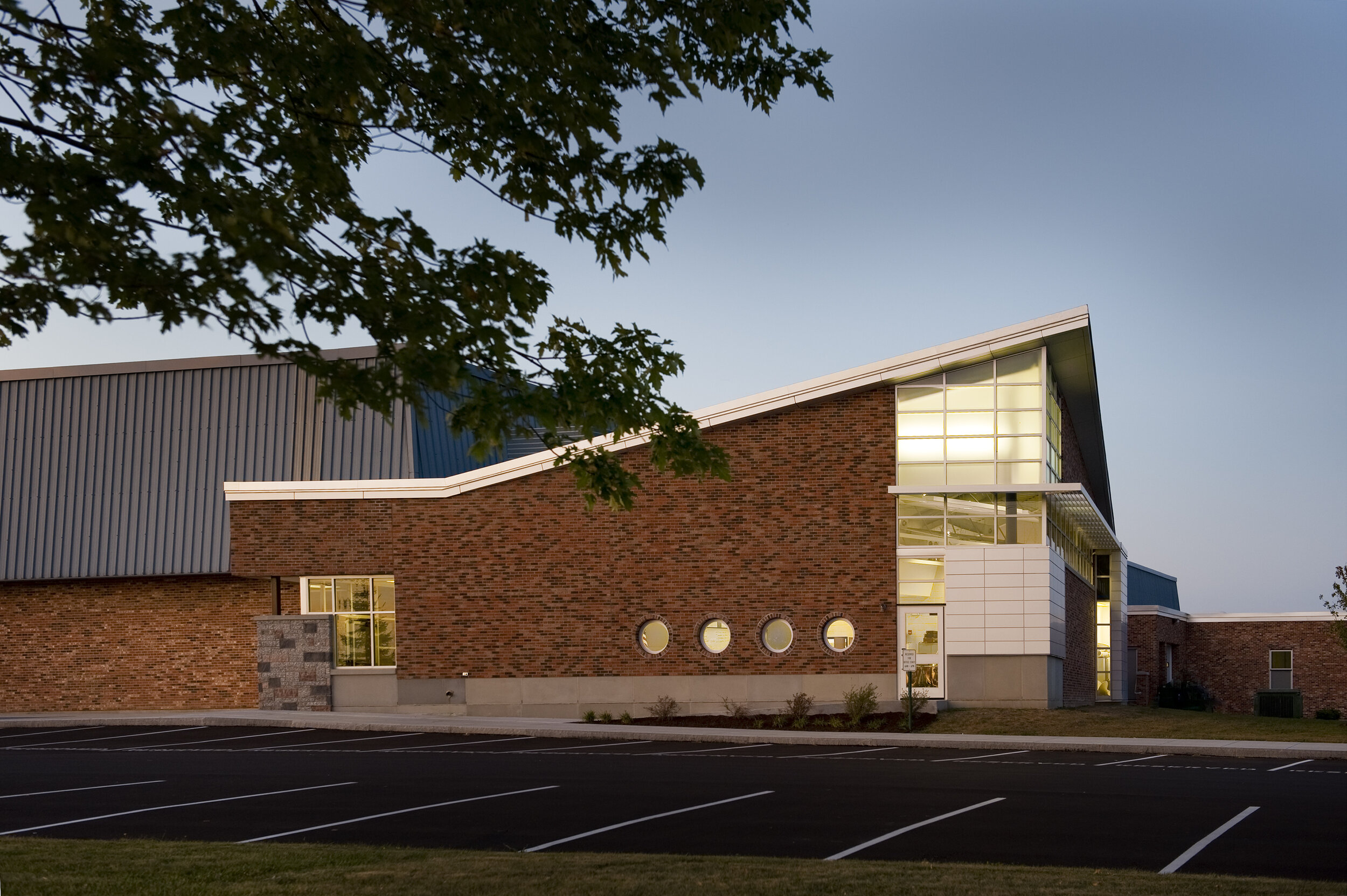
The 2017 Capital Project at Binghamton City School District is meant to be in conversation with the steady progress of the city. Like its context, while strong in spirit, the facilities were lacking a sense of identity, excitement, and, after many disjointed additions at a few schools, clarity of intent.
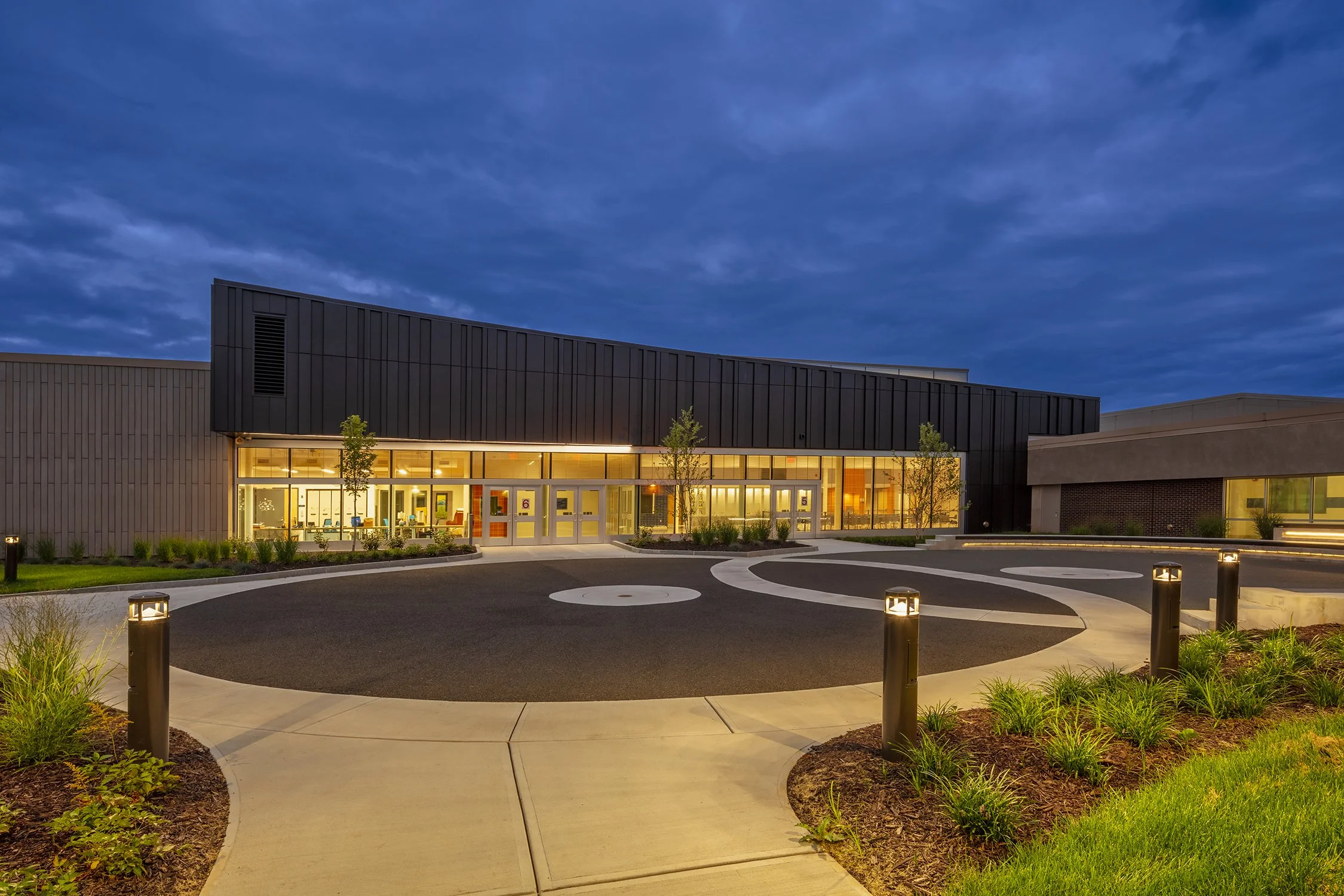
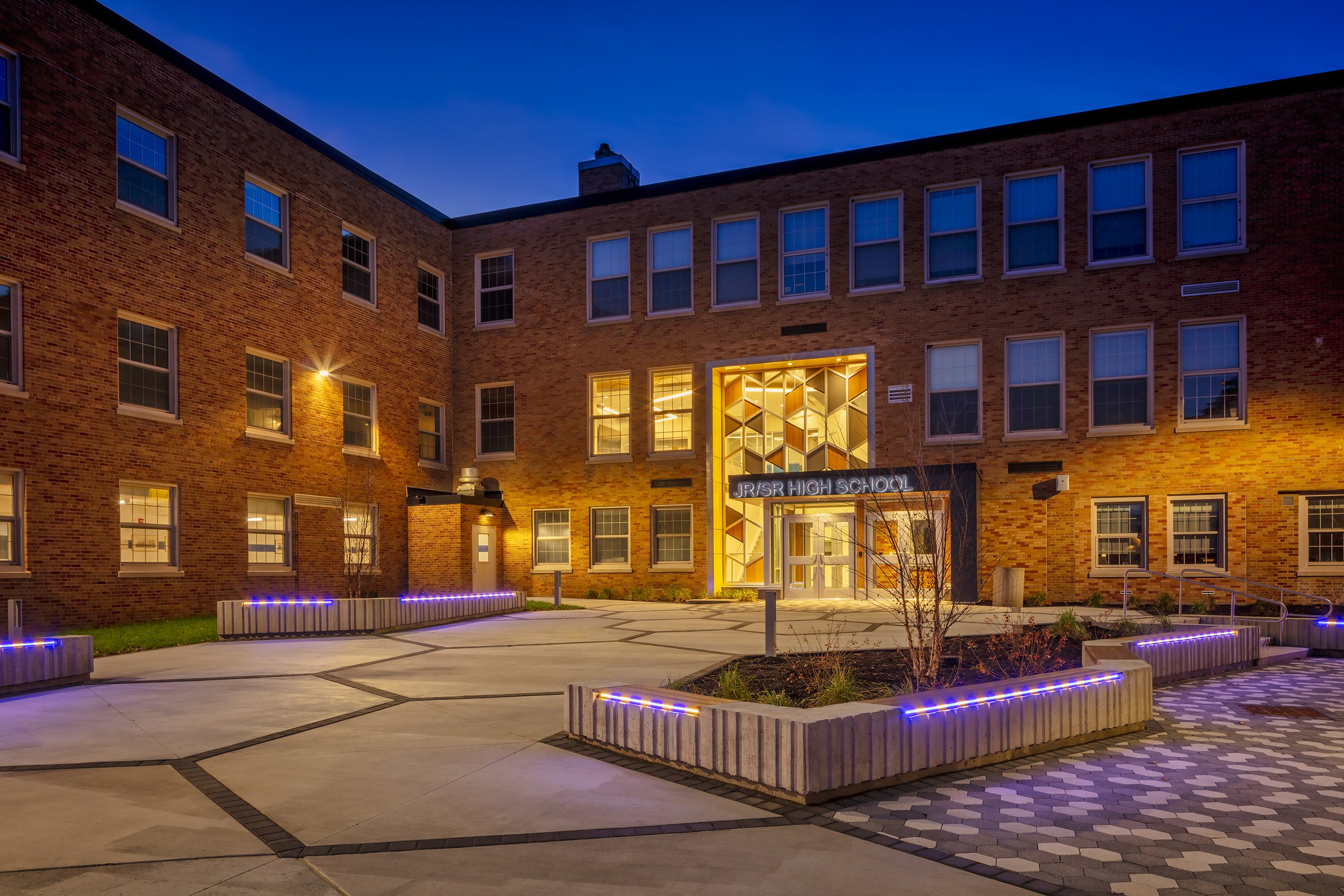
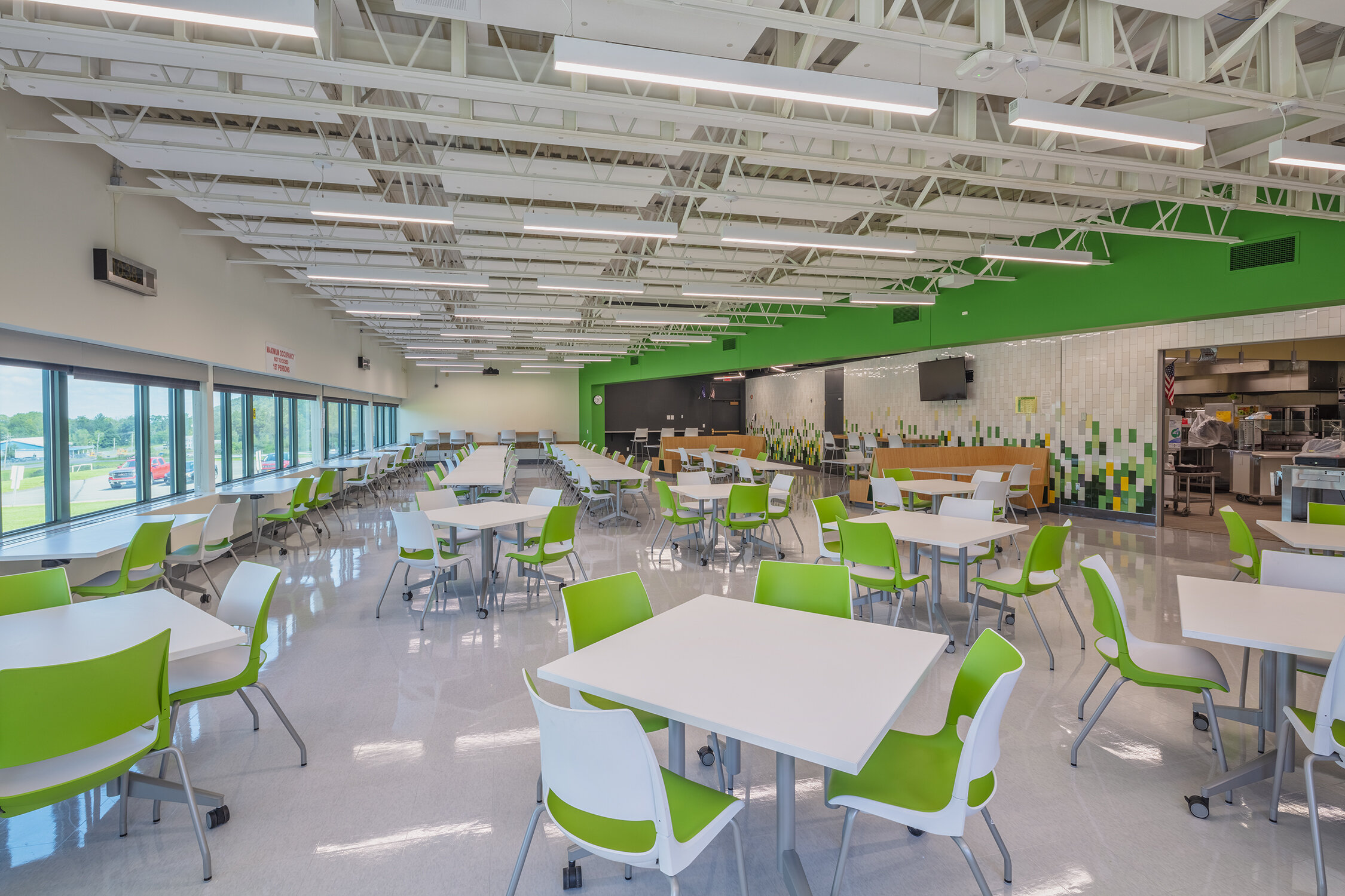
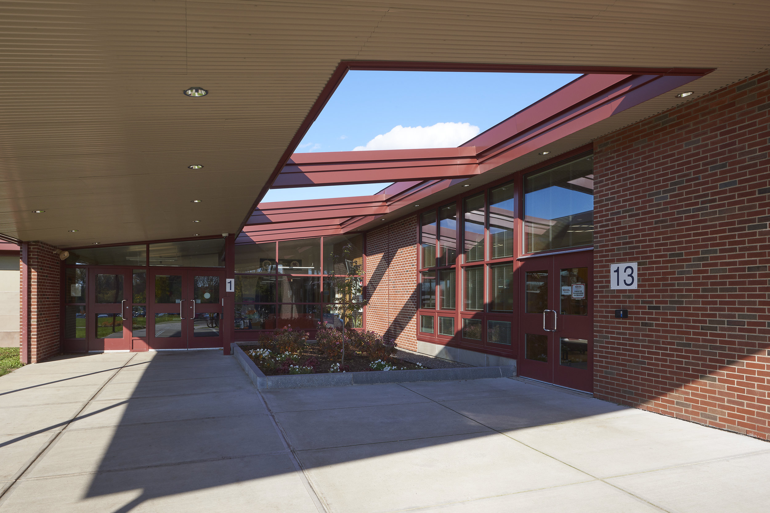
Binghamton’s High School entrance had long been a blemish on the face of the locally iconic building. While the defunct original Main Street entrance was visible, grand, and inviting, albeit distant, the functional one was buried behind an ominous metal fence and a much-bemoaned watchtower-like guard post. Upon entering the building, a student or visitor would find a series of check-in machines under a low ceiling and a confusing reception area that encouraged one to move away from the hallway that allowed for better access to the school. On the adjacent Oak Ave, there was an opportunity for an entrance that put the High School’s best face forward and incite pride in those who called the school theirs. Oak Ave is still an urban street but not as busy as the major artery of Main Street—it offered a less exposed point for busses and students to gather at the beginning and end of the day. And here, a light-filled hub existed at the cafeteria with access to a small courtyard area. It was also here that several disjointed additions connected. As one team member remarked, the new lobby they needed was already there, it just needed to be uncloaked.
Security was still paramount to the district, but the new solution allowed for the maintenance of the school’s typical security process in a space that was more functional and attractive. The access point widened so that more students could move through the check-in point and fewer would be waiting for entry outside during the winter months. The security office has access to the lobby’s vestibule so visitors can be screened before they entered the building. Should a student be late, instead of having to go out of the way to the attendance office, they can now visit the attendance monitors on the side of the vestibule opposite to the security office.
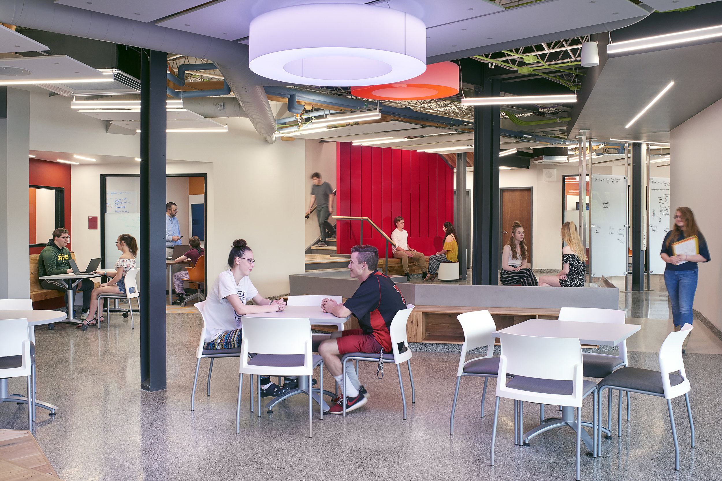
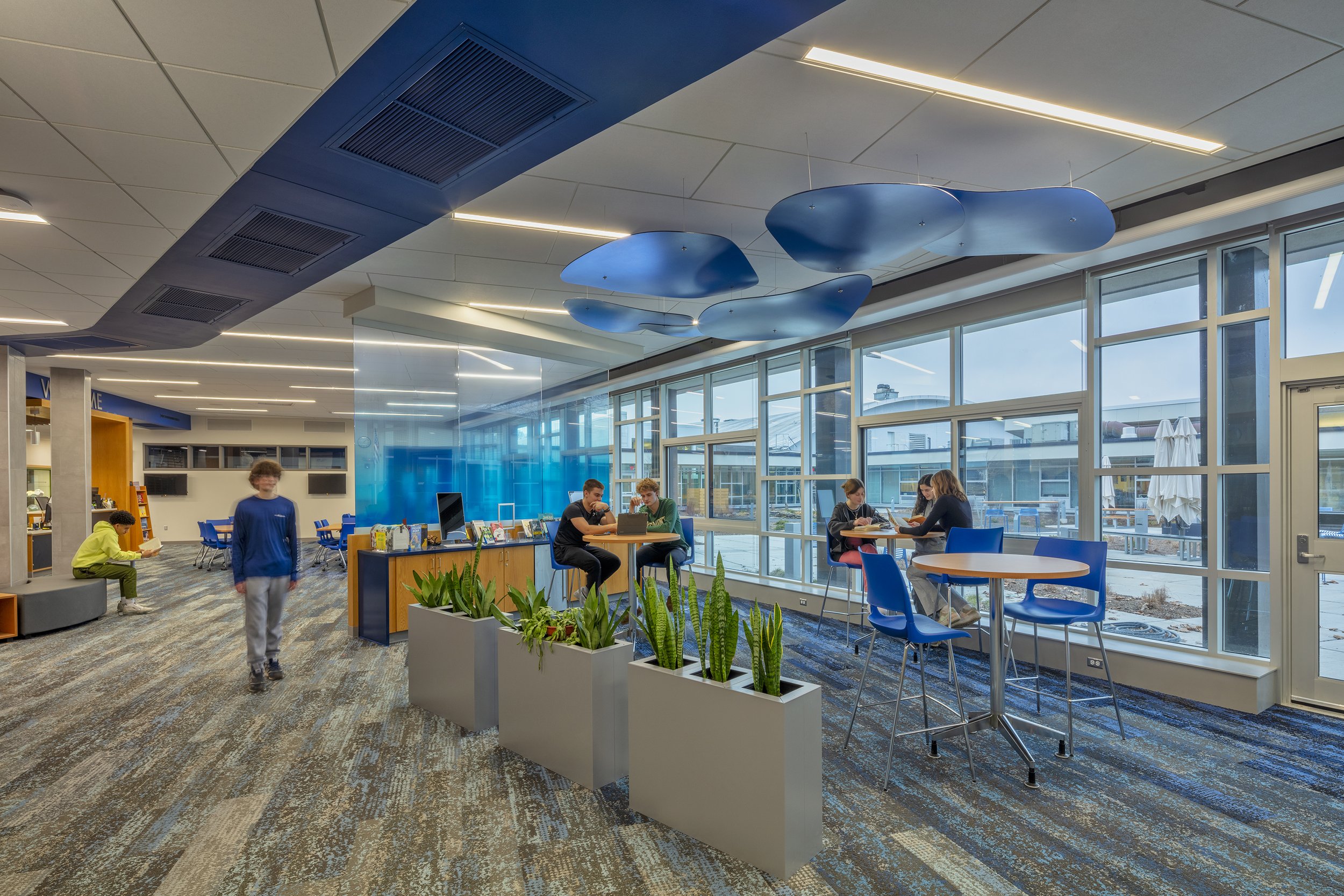
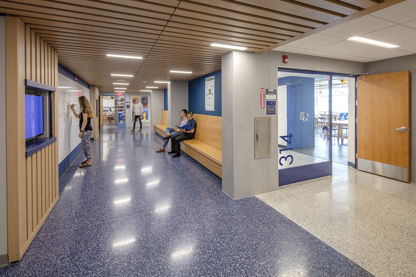
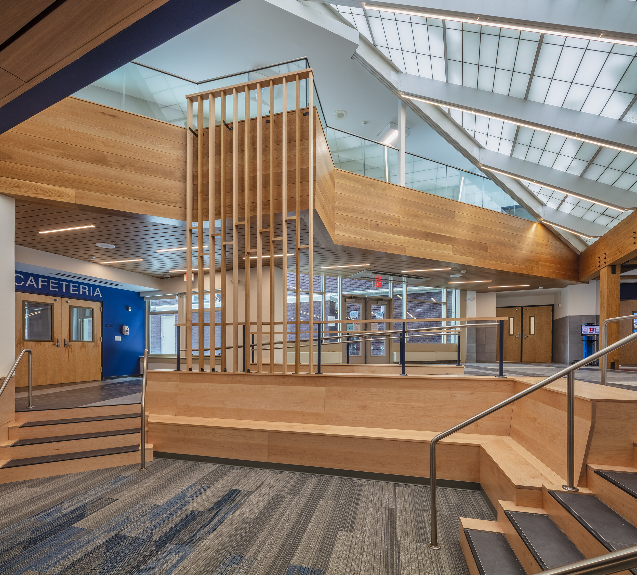
Upon entrance to the lobby, one walks through a vertically compact transitional space that is punched with Sola Tube skylights, then is released into the multi-story atrium. The existing transparent ceiling system allows for light to spill into the space even on a cloudy day. A new wood element, affectionately called the “waterfall,” helps to draw the eye up and provoke awe. The existing lofted interior bridge was wrapped in wood and given a new jut-out for peering below. To complement the warmth of the wood, the district’s color of blue is present in signage and flooring, and the blue-toned gray stone flooring’s pattern mimics that of the new stone in the outdoor courtyard, creating a feeling of continuity. From a sunken reception area with wood-clad seating one can enter the Main Office with much more confidence that one is in the right place. The doors to the Main Office are flanked by display cases to create a miniature gallery of student work and achievements. And doors to the cafeteria and access to a faculty parking lot are also now present in the lobby.
Site work included a re-working of the courtyard off of Oak Street. Effort was made to create small areas for gathering, to guide one toward the school with the paving pattern, and new exterior signage and cladding bolstered the sense of pride. Visitors and future students will no longer search for a shadowy entrance—the main doors now present themselves clearly and proudly. Parallel to the cafeteria and the leading into the new atrium is another access to teacher parking and ADA access for guardians and alumni, which received new paving and exterior lighting to complement those in the Oak Street courtyard.
Upon visiting the lobby at its completion, one member of our design team overheard two students discussing the new space. To paraphrase, one student said to the other, “Everyone thinks Binghamton is just [made up of] bad kids—we needed something like this.” If students can be proud to enter their school, then the design did its job.
High School Lobby - BEFORE
High School Entrance - BEFORE
High School Lobby - AFTER
High School Entrance - AFTER
Photography: Revette Studio


